Friday, April 13, 2012

To Good Times And Synchronicities!


Here is my rather Larry offering to this week's The Play Date Cafe Color Challenge featuring Daffodil, Hydrangea, Kiwi, and Cherry.  For some reason, October Afternoon's Boarding Pass DPs just came screeching to mind when I saw the week's inspiration collage and I knew exactly where I was going to find something perky to use.

While I was in the midst of crafting this card for this challenge, prior to even conceiving the idea to add flowers (actually, at this point, I think I was rather captivated by those bathing beauties pictured, to be honest), my beautiful 17 year old daughter came home with a delightful posy for me.  I adore how wonderfully thoughtful she is as she collects and arranges the wildflowers she plucks (best not to think of from where as we live in the inner city) for me as she makes her way home from school or her other adventures each day.  When she passed them to me, two of the flowers fell out and landed on my craft space next to the die cut October Afternoon layer and the Tim Holtz embossed base of Spring Moss cardstock I had crafted thus far.  Talk about a light bulb moment, because the delicately dropped flowers were the sweetest daisies and they looked as if they totally belonged as part of this papercraftng picture all along and I just hadn't known it.  Don't you just love life's little synchronicites?  I sure do.  So off I went on a mission to craft some daisies for my card.  So cool.  Wouldn't you know it, I fossicked out my My Favorite Things Rolled Daisy die and off I cranked.  The centre of the daisies were just some random clear rhinestones I colored up with a Tria marker and glued down.  Nice.  You have no idea how chuffed I was to achieve a rather daisy-esque looking pair of blooms.  You might have to squint a bit though but hey,  I reckon they'll pass.  Needless to say, this card just pretty much took off from there and quasi-artishly mirrors the vision I saw before me.  I couldn't think of a better sentiment to use than the "Good Times" from Papertrey Ink's Road Trip set.   The sentiment mat is just one of the many fabulous labels from Waltzingmouse Stamps.

So there you have it folks.  Thank you for allowing me to share with you just another of my many musings in papercrafting.  To good times (daisies) and synchronicities!  


Edited to add:  Although I am not a stranger to Simon Says Stamp (love that place), I have only just found their challenge blog dedicated to all things Vintage: Simon Says Stamp And Show.  Am I as happy as a pig in poop or what?!  So I have linked this card there too.  

Tuesday, April 10, 2012

Hot Stuff!


I know I have used this image a fair few times to date, but I just love these little quippy Crafty Secrets delights from their Coffee and Tea set.  I am not Queen Copic by any stretch, but I do enjoy a wee scribble every now and again.  Plus, I also wanted to try and make dent in this momma beef sized pack of Pinefeather cardstock by Papertrey Ink that is gathering dust and hits me with a few pangs of guilt as to why on earth I actually bought it each time I pass it by? It's a lovely green, that is for sure, but not one I use very often without a hardcore prompt outside of maybe The Festive Season.   So, I thought, why not?  Let's give the old Pinefeather a go and see what happens.  Low and behold, I think I kind of like myself some Pinefeather now, especially when stamped with this Hero Arts Cling Background stamp called Asian Flower Pattern and when given some sooty edges.  This cling stamp seems to transcend the Christmassy vibe that I have always gotten when I see this particular green cardstock.   It's not a bad vintage green, eh?  I like that, when I can see my supplies in a new light and hopefully now it will sprout some legs and get itself used more often.  Buyer's remorse, no more.  Most excellent.

Thanks so much for popping by.  (Not that I can do too much popping myself (outside of literally) from all the wonderful Easter festivities of late though. Yum.)  Here's to a blessed day for us all!

Monday, April 2, 2012

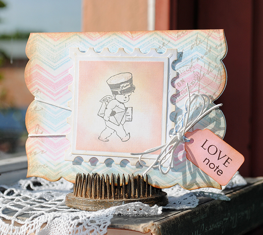
A Cherubic Love Note.


(Click photo for more of an eyeful.)


The colors for this fortnight's CR84FN Color Challenge are Pink, Peach, and Light Blue and are so very ethereal and angelic and seemed the perfect driving force for this card.  Is that not the cutest post carrier you have ever seen, I mean really? I was instantly smitten with this darling cherub from the moment I laid eyes on it.  It comes from a small clear stamp set from Crafty Secrets called French Mail.  Adore.  This card was also made with my latest die crush from Spellbinders.  In order not to embarrass myself with how much I love the shape of this die, I will just leave you with the name and a warning that you can absolutely look forward to seeing Spellbinders Grand Labels 23 and all its permutations a heck of a lot more for the foreseeable future, that's for sure.  Bliss.  Seeing that there is so much love in the air with this card, I had to craft it into a love note.  Of course, of course.  The stamped chevrons are from a fun background building set from Waltzingmouse Stamps, called Offbeat Backgrounds.  The sentiment is from Papertrey Ink called Paper Trey.  This sentiment only set is so rarely seen across any of the crafty blogs I frequent, which makes me wonder if it looks a lot more garish to others than it does me?  I love this set for its quirky font size and nifty use of upper and lower case.  I do often wonder why its sightings are a bit like hen's teeth though?  And yes, that's my favorite of all time script text stamp from Hero Arts peeking out from behind the postage edged focal image. I've talked you ear off about that one before.  Yep, that's the one...again.  *wink*  

I am off to run a few errands now and hopefully be able to sneak in some crafty time today.  Wish me luck.  Our beloved craft is such a life force, isn't it?  Good stuff.  Thank you so much for stopping by.  Here's to an inspired day for us all!   

ETA:  I stumbled across Crafty Secrets 1st Linky Party on their blog and included my card.  Perhaps you might like to join in the fun too.   


Thursday, March 29, 2012

For My Teacher.


As you would imagine, with a brood my size, I have had to make a fair swag of teacher's Thank You cards for various teachers over the years.  This card is one of the more recent ones I made to go out in the last batch.  I have been meaning to post it on my blog for yonks, but, but, but.  You know how that goes:  Best laid plans of mice and men...

Nothing too flash about this card using all of the Vintage Picnic accouterments from Papertrey Ink, but it turned out rather homely which I quite liked.  I glossed up the apples for good measure, using Glossy Accents after crudely coloring them with Copics.  The die-cut picnic basket was then stamped and heat embossed with Zing! embossing powder in Gold.  The other bits and bobs were from Spellbinders. I used their Nestabilities dies from the Postage set, Classic Squares, and Doily Motifs.  I cannot recall which DP I used, but I am willing to take a punt and say that it was a page from Basic Grey's, um...er... Hello Luscious perhaps?  To be honest, I cannot even begin to recall what the other papers are.  I just used my scrap box (yep, the one that is bigger than all get out) as a bit of a Lucky Dip and away I went.  Nothing like a little "surprise chef" cardmaking to get you under way.  Not much more to add, save making a Note To Self to use the various Vintage Picnic odds and sods a bit more because I do find them rather sweet.

Thanks so very much for for stopping by.   It's a treat as always! 


Tuesday, March 27, 2012

Autumn Down Under Style.


  Even though I have lived in Australia for the better part of 22 years, I still get homesick.  In Australia we are 27 days into Autumn now (but who's counting?) and I couldn't be happier.  I find the summers here to be oppressively hot and humid most days (and nights) and the older and more crotchety I become the more I seem to be even more blessed with an abundance of humidity.  Somebody please remind me what a good hair day is?   Oddly enough though, in some places, the leaves do change color and the temperature does drop some.  So, with the making of this card, I momentarily transported myself to the wonderful New York Autumns that I so fondly recall.  The crunchy leaves, the crispness in the air,  the piles of raked leaves and the beautiful autumnal array of colors that abound.  Just lovely.  This card is a tribute to those very days.  Even with the soon to be defoliated trees few and far in between here, my eyes and senses are trained upon them for their rare showing during this super short season.  I can't wait.

For the most part, this card was put together from various doodads from Papertrey Ink.  I love their Autumn Acorns set for obvious reasons as just described, but it is also a cherished set for the font used for the sentiments.  Gosh, it's a goodie.  The lattice rectangle is from Spellbinders and is a die set of the same name.  The mustard color background stamp is a nifty Cover-A-Card from Impression Obsession called Round Floral. Love their big squares of red rubber fabulousness. It may be worth mentioning that the splotchy acorn bottoms were made deliberately so by choosing my most splotchy dye ink and tissueing some off only ever so slightly.  I had hoped to get the unevenness to resemble texture.  Well, that's my story and I am sticking to it. *wink*  As for the rest, feel free to let me know if you want to know more.  It would be my pleasure.

...And that's that card done.  Thank you for stopping by.  I appreciate your visits so.  To colorful and crunchy leaves! 

Monday, March 19, 2012

Frippery?


Now there's a word you don't see everyday.  Frippery.  Frippery.  Frippery.  There, I bet that is the most I have ever said and just a few short of ever having seen that word in my life.  According to the dictionary, Frippery denotes the following:

frippery |ˈfripərē|noun ( pl. -peries)showy or unnecessary ornament in architecture, dress, or language.• a tawdry or frivolous thing.ORIGIN mid 16th cent. (denoting old or secondhand clothes): fromFrench friperie, from Old French freperie, from frepe ‘rag,’ of unknown ultimate 

Funny word, ay? Come to think of it, I may have purchased this newest released Waltzingmouse set not only because of its superlative images, but also because of this word, but unfortunately I cannot confirm nor deny the exact percentages as to which was the true mitigating factor, especially where anything tawdry or frivolous is concerned. What?  Like you didn't know I was a bit wacky in that way?   The flower was made by stamping the four pointed image from Florentine Frippery.  There is a spellbinders die that directly corresponds to this shape, but I cut out three of the stamped images by hand as I don't have the dies (yet). Too easy.  In fact, it was so effortless, it kind of has me wondering why on earth did I even bother placing an order for these exact dies?  Oh well, better to have them and not need them, then to need them and not have them, right?  (Sounding like a true craft tool hoarder, aren't I?)

The background was stamped with another of the beautiful stamps from the sets just having been released by Waltzingmouse.  It is called French Country.  Très, très jolie!    The sentiment on the tag is also another Waltzingmouse goodie.  It comes from a classy and oh so handy set called Fancy Phrases.  I know according to this weeks sketch there is supposed to be a rectangular layer under the flower, but the inner rebel in me just didn't want to. Busted.  Do you ever have those days when you feel like it would be nice to just go the less is more route with your card?  Sounds funny coming from someone momentarily obsessed with the word frippery doesn't it?   I just thought that my choice to go with the three layered "Fripped Out" flower, vintage lace, hefty swing tag and white double wrapped wax string was enough. Fingers crossed I don't get kicked out the challenge for being a tad cheeky in my interpretation of the sketch.  Oh wait, I could go with that additional layer in invisible cardstock.  Do you think they'll buy that?  Me either.  Oh, well, what about a promise to do better next time?  That I can live with.

Thanks so much for allowing me to share my (mis)adventures in papercraft with you.  As always, it's been a blast!  Here's to a stellar, fun, and frippery-filled day!      

Wednesday, March 14, 2012

Hello...My Fabulous Flutterby Friend!


I saw a video during one of Jennifer McGuire's most recent Online Card Class where she made a butterfly shaped card using this Memory Box die called Maribelle Butterfly.  I was instantly captivated by her gorgeous card with its regal wings outspread and all the lovely detail embossed across its span.  So I scoured the Internet until I found this die to purchase and could be shipped reasonably and expediently to Australia (Simon Says Stamp).  Talk about being happy to see the post man on his arrival a couple of weeks later.  Sadly though, my glee was rather short lived when everything went pear shaped once I lay my hand to recreating Madame McGuire's masterpiece.  (I know, I know, alarm bells should have started ringing then, even if video was provided!  Sigh.)  My card is the end result of just layering all the die cuts I made in attempt to CASE her card.  But my die cuts were just of the butterfly in silhouette with its wings in various states of disrepair.  Whoopsy! Eventually, admitting defeat,  I decided to just stack all of the butterfly's bits on top of one another, slightly overlapping, and paint random sections of the wings with iridescent acrylic paint in varying shades of red, blue and violet then alighting it on the side of my scrolly sentiment tag.  I am not altogether unhappy with the end result, but my flutterby is definitely different to what I had originally imagined.  I sure would appreciate any tips if you know the how-tos and wherefores of Jennifer McGuire's shaped butterfly card.  I am definitely up for a take two.  What do ya reckon? 

Thanks so much for stopping by.  Here's to a wonderful day, friend!