Wednesday, August 31, 2011

Thanks With A French Twist!

Click picture for more of an eyeful. 


This is a very last minute entry into this week's The Play Date Cafe Color Challenge showcasing Mint, Ivory, and Coral.  Staying true to my more vintage leanings, I took a rather "aged" approach to the colors.   I also reveled in the opportunity to work with another of my many secreted away crafting goodies that hadn't had an airing for donkey's years:  Spellbinders Labels Eight Nestabilities Die.  Talk about a fab shape.  It really was nice to be reacquainted with this lovely set of dies.  You have no idea how wonderful it has been to fossick through my much loved, thoroughly burgeoning stash....such cool stuff! Lucky me.  

And for your lovely visit to my blog...Merci.  Here's to a beautiful day! xx

Supplies:


  • Stamps:  Hero Arts Diagonal Dictionary Woodblock, Papertrey Ink Think Big "Merci", and Impression Obsession Cover-A-Card Rubber in Retro Florals. 
  • Accessories:  Spellbinders Labels Eight Nesties, Tim Holtz Tattered Florals Alterations Die, My Favorite Things Rolled Rose die, Keisercraft Pearl, Size #3 Shipping Tag, WRMK Corner Chomper in Scallop, Acrylic Paint in Coral, Antique White, Copper, and Ivory, and Rustic Jute Twine.    
C'est tout! 


Friday, August 26, 2011

Papertrey Ink's August Blog Hop.


How beautiful is the sentiment, "To Love and Be Loved Is Everything"?  So magnificent.  I knew I wanted to use this sentiment before I had any inkling as to the design of the card.  Lucky for me though, I had this wonderful inspiration photo to build on and it has the most tantalizing group of images and aspects to choose from.  While none of the elements save the flowers are literal, I enjoyed taking the essences of some of the other elements that spoke loudest to me to build the card.  I really was spoilt for choice.  As you will see the gigham dress is present on the side of the card base, the damask stamped sentiment panel peresents the inner patterning of the vintage case,  the suitcase is in attendance with the curved scarlet jewel Linen and Canvas impressed  panel at the bottom and the book print patterned paper is representational of the books.  Only Papertrey Ink stamps were used (or as some might say harmed) in the making of this card, and they were Damask Designs, Background Basics: Gigham, and Happy Trails. What fun!    

Well that's me done for now.  Thank you so much for bopping by the blog.  Happy hopping! 

Friday, August 19, 2011

Time To Celebrate!


Ever get slight twinges of angst when you realize that you have a fair swag of purchased but not often used crafting supplies?  I do.  Although I do craft often (pretty much daily) and with a variety of crafting supplies...my supply far outweighs the demand.  The fact that I have more than I probably will ever wearout or use up bothers me less than the fact that I haven't gotten around to having fun with each and every one of the delectable goodies I have diligently and lovingly amassed.  So I have set myself a task to try and use at least one either never used or hardly ever used goodie each time I make something for the next little while. Yep, that's the plan.

For this card, I used a Tim Holtz Hanging Sign Alterations Bigz die as my chosen goodie. This is a rather nifty die I must say.  It comes complete with the sign and the cool ornate watchamacallit to hang the sign from.    This card was inspired from the current Waltzingmouse Sketch Challenge sketch by one of my favorite papercrafters and WMS Mischief Maker, Kelly Shirmer.  I took a not-so-small liberty with the sketch and lowered the shapely sentiment panel by constructing the sign element as this aspect of the sketch. I probably will get 50 lashes with a thread of cotton for doing this but...I thought it was a kind of cool albeit cheeky take on the sketch.  I love the wonderfully curvaceous Waltzingmouse sentiment set Say It Loud and thought it a good match for all the voluptuousness of the Tim Holtz die and the Spellbinders Gromit tag below, at least in my own lunchbox it seemed, that is.

I also had a bit of fun using some textured charcoal cardstock for the sign and the white corrugated board for the hanging thingy. Embossing on textured cardstock generally doesn't ever end well, but I was after that distressed enamelled look often seen in actual vintage signage these days (well that's my story and I am sticking to it) so I thought I'd give it a go.  That lovely blue stripey DP is from the new Authentique range of  6x6 pattern papers.  Somehow,  I think Authentique is the company formerly known as Girls Paperie and still gorgeous.  The other bits and bobs used are from my stash.

Initially I thought this card was going to be a more masculine card, but I obviously couldn't resist the lure of a rose and the pearls, so out the window that idea went.     Ah well, what can you do?   Nevermind.

Thanks so much for swinging by the blog.  I appreciate your visits so.  Have a wonderful day!  

Monday, August 15, 2011

You're Always Invited.

Please click to enlarge


No point in denying it, but I have a thing for roses.  Yep, by virtue of being a rose alone is enough to get me to either purchase it, want to wear it, ogle it, or even smell it.  Roses absolutely capture my attention (especially seeing that at times I can have the crafting attention span of a gnat).  So when I caught sight of this Penny Black rose stamp called Rosa, I knew it had to be mine, mine, all mine!  (Bit strong? But only if I say that in a maniacal voice, right?)  Another image or family of images that I seem to have eyes for are flourishes.  I do love a good flourish or two.  Particuarly ornate ones that are reminiscent of vintage wallpaper (again, another of which I have a rather strong penchant for).  So when I can create something with roses and flourishes, I am a happy chappy. But if I really wanted to amp up the enjoyment factor even more, all I need to do is add a tag.  Swing tags, shipping tags, charm tags, any tags really will merrily fulfill the brief.  Heaven.

This card was especially created for this fortnight's CR84FN Color Challenge using Yellow, Kraft, and Neutral.  Just perfect.  Funnily enough, this card is a wedding invitation...my kind of wedding invitation.  Well, at least the soon to be betrothed won't have to worry about having the same ones as the Jones', right?  *wink*

Thanks so much for popping by and here's to a fantastic day!

Supplies:


  • Stamps:  Penny Black Rosa Woodblock, Hero Arts Fabulous Flourish Woodblock, and Watzingmouse Stamps Afternoon Tea
  • Paper:  Papertrey Ink Kraft and 7 Gypsies Conservatory
  • Accessories:  Size #4 Shipping Label, 1" Satin Ribbon, Large Champagne Satin Rose, Fiskars Small Tag Punch, Copics, WRMK Corner Chomper in Scallops, Jute, and Tattered Angels Glimmer Mist in Iridescent Gold and Coffee Shop, Cream Acrylic Paint, and Zing! Embossing Powder in Burnt sugar.


Monday, August 8, 2011

Bee Positive!


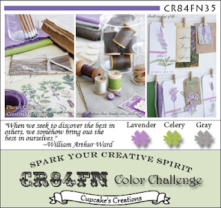
On the days when I just can't seem to kick it into gear, the best I am able to muster is to craft an affirmation for higher spirits, warm & fuzzies, rainbows, sunshine, and all that jazz into my cards.  And then pray to the Good Lord that it will, even in the most miniscule amount, rub off on me.  This card is, indeed, one of those wishful thinking type cards.  I used the colors of this fortnight's CR84FN Color Challenge of Lavender, Celery and Gray.  I went to this challenge in particular because I love its slogan of "Spark Your Creative Spirit."  Yep, I felt like I needed to pull out all the stops in hopes that something would give.

I pretty much used all Papertrey Ink goodies in the making of this card. The only non-PTI items are the image on the Celery colored rectangle with pinked edging and the ribbon, flower and lamé trim.  The green floral image is a lovely Frangipani laden, red rubber stamp from an Australian company called Darkoom Door Stamps.  I have several of their stamps and they are worth a look at, as the quality is fab and the images are largely photorealistic and a lot of fun.

Thanks for popping by for a visit.  I hope to see you at the blog again soon.  Have a glorious day!

Supplies:


  • Stamps:  Papertrey Ink Honey Bee and Honey Bee Additions and Garden Variety.  Darkroom Door Frangipani 
  • Accessories:  Papertrey Ink In Bloom Impression Plate, Boutique Button Die, Garden Variety Dies, Pinking Shears, Corrugated Cardboard (yummmm), White and Gray Acrylic Paint, and purple paper flower (origins unknown),  a snippet of some silver Lamé from my stash and WRMK Corner Chomper.  

Wednesday, August 3, 2011

A Mix And Match Fabregé Cupcake Safari.


TSTR Mix and Match Inspiration Photo


Nothing like a good cupcake if you ask me.  I especially created this cutie-pie cupcake for The Shabby Tea Room's Mix and Match Challenge.  The challenge is to use a minimum of three different pattern papers, either manufactured or handmade in a mix and match paper project.  I must say that as much as I adore a good cuppie, I too adore (probably too) much of the delectable designer papers that are about making this a great challenge for me.  Yum. Seeing that I am also having such fun making baby cards with a wee difference of late, I thought, why not throw another one into the mix.

The rather, um...er, lumpy cupcake shape came about from me taking slight liberties with the Prima Marketing DP that I used for the frosting. For some strange reason I wanted more of that particular paper to show.  So, I just extended it (probably a little too much) beyond the original Papertrey Ink Shape Up Series Cupcake die giving it it's more ovoid than cuppie end shape.  Oopsy!

The other fun bit of the card making was the texturizing of the cupcake wrapper.  I used my recent crush of corrugated cardboard (again!) and die cut it from the wrapper die base which has some nifty additional perforations on it already.  This neat little coupling is even cooler when you peel back the top thinner layer of the cardboard after it's cut to reveal its funky highly textured underbelly which is definitely too cool for school especially when given a few licks of acrylic paint.  Again, yum.   The other pattern papers used are perhaps, less obviously, on the sweet spotty elephant's ear (yep, that is a medium die cut heart upended..crazy , huh?) and some Basic Grey Basics Manilla DP backing PTI's Sweet Baby elephant.

I am rather fond of this quirky card.  Not because it is so well made, because it's not nor do I think I have demonstrated skills particularly extroidinaire because I haven't, but because it is just so charmingly homespun.  Yes, that's it...I think it's rather folksy-fab!

But really though, thank you ever so much for allowing me to share my musings with you.  It's always a pleasure when you come for a visit.  Have an awesome day! 

Monday, August 1, 2011

Bloom Where You're Planted.


This is a rolly scalloped number that I whipped up especially for The Play Date Cafe.  I was instantly smitten by this week's colors there.  Petal Pink, Coral and Antique Gold always seem to work a treat when combined.  Well, they certainly play nicely together which is imperative when partaking in a play date or if in the very least you are hoping to be in with a chance of getting invited back, right?

There isn't too much going on by way of stamping on this card, with the exception being on the pink swing tag and that sentiment is from PTI's Tag-Its #3.  There is, however, a heck of a lot of Tattered Angels Glimmer Mist misting going on, but sadly, not exceptionally visible in the photograph (on my work bench, fingers, scrap paper base, two year old son and cat...plenty).  I nearly sprayed half a bottle of Cadillac Pink, Irridescent Gold and Gold, and alas, only a mere (pretty) glint.  Nevermind.  The pattern paper is a bit of coral colored fun from the 7 Gypsies "Lille" 6x6 pack.  The pink cardstock used elsewhere is good ole fashioned Sweet Blush from Papertrey Ink.  Sweet Blush is such the consummate color.  Lots of acrylic finger painting fun was had all along the edges of the scallops.  I used petal pink, copper, and a touch of white.  The sectioning of vintage crochet lace trim, button and the paper flowers are all from my stash.  The leaves are actually some velvet holly leaves that were flipped over and cut into a different shape.  I thought I had a packet of proper (non-Holly) leaves somewhere, but they were nowhere to be found.  Oh well.  I think that's this card done.

Thanks so much for stopping by.  Have a wonderful day!