

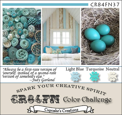
I actually made these two cards early last week when the latest CR84FN Collor Challenge went live. I was instantly smitten with the color combination and the inspiration images showcasing Light Blue, Turquoise, and Neutral. Yum. I delayed in posting my entry though, simply because I couldn't decide which one to enter. Sigh. Seeing that the fortnight entry period was starting to draw to a close, I didn't want my dithering to have me miss the boat entirely. So, apologies in advance for the two entries, but what's a girl to do?
I made the Happy Birthday card first and then the Coffee Shared card just after. Funnily enough, they aren't all that dissimiliar really. Papertrey Ink Stamps were used across both cards (save the Stampington & Co. Sheet Music Woodblock on the first). I employed Ad Sense and Warm Happiness stamp sets. I can't recall where the pattern papers were from. I'm kind of thinking October afternoon and Authentique? Hazards of dipping into your scrap bucket I guess. The cardstock used is the sublime Papertery Ink though, that I do know. I had major issues photographing these two cards and watermarking them also proved rather interesting, hence the variations in size and general poor imaging. I am starting to think I am not meant to post or enter these cards, period. *shifty* Maybe they're cursed? Or I'm cursed? Dunno? Ack! I give up. Sorry. *wink*


17 comments:
Gosh, it is a toss-up for me too Jen, I love them both. I love that add paper in the one with the add sense frame and that sparkly coffee mug with the word coffee done in the neutral cutout. Both are great and that really is a great color combo. So soft and pretty. Great job today.
I'm with you--I love them both, and don't know which one I would submit. They are both lovely enough to win a contest, so you can't go wrong. I have to admit, when I first saw that color combo I didn't even think of participating, because I could not see how those colors would work together. But, you have shown me how lovely they can be. Thanks
Gorgeous cards. Great color combination. My favorite is your warm happiness card. Love all the elements. I especially like the lace, background paper and of course, the glitttering cup.
Wow I love them both, it would be hard to choose. Because I have a polka dot mug that I love, I am leaning twards that one. Tough choice, can't you enter two .
Beautiful cards Jen! Love the embossed detailed and sugary coffee cup! Thanks so much for joining along with CR84FN :)
Both are fabulous. I am partial to coffee, but I don't think I can decide either. Why not enter both silly girl? :)
Hugs~
Both are so beautiful, Jen! My fav is the one with the embossed background and the fun paper! Great job!
Both cards are just fab - but as a huge coffee fan, for me it's the coffee card! Of course, you could simply enter both cards :) Thanks for playing along with CR84FN!
Love both cards, en. They really have a vintage feel woth the frame and papers. I think my fav is the coffe one - it's a really warm and welcoming card and I love coffee!!
Jen........Both of these are so, so pretty! Isn't that color combination just so fun??? Love the mix of fun paper and, of course, the bling on that cuppa!!!
I love them both! Love the embossing on the one, and love that wide crocheted trim on the other! Love the soft, distressed, vintage feel and layouts of BOTH!!
Love your blog it visit often. You ask a question a while ago about the 3D flowers sizzix conpared to the flower mft have and was wondering if you can help me out - are they both the same size? -thanks Sandra
I'm glad you couldn't decide and made and shared both! Blue is such a challenge for me....but not for you! And yes, those are OA and Authentique papers. Just love the days gone by feel...
I'm glad you posted both because they're both fab. I love this colour combination too and the slightly aged retro look you've gone for. Yum is right!
You crack me up !!! I relate though, they are both quite fabulous. What is a girl to do ??? Post both of course....xoxoox
LOL knew Michelle the PP queen would know the answer !!
LOVE both cards, but I absolutely adore how the feel of the bicycle/newspaper goes with the retro ad sense die...such a perfect vibe on that card !!
Beautiful cards. Love the sparkly mug. This set is one of my all time favorite from PTI.
TFS
Ang
Post a Comment